Mahalo.life (FKA Karen)
MOBILE FIRST DESIGN (Academic Project with a real-world client)

THE BRIEF
Taking care of aging family and loved ones can be an overwhelming process. Karen is a task management application that helps families organize caregivers, finances, legal matters, and healthcare to ensure a better quality of life. Elder care is a $400 billion market, growing 5% annually, and Karen intends to become a pioneering platform in this space. Stakeholders at Karen approached our team with a beta desktop platform that needed integration into a native mobile-first design. After preliminary research and synthesizing existing user testing data, we created a prototype that improves clarity, usability, reduces cognitive overload, and enhances repeat engagement.
THE PROCESS
Timeline: 3 week sprint
Team: Christine Tayaba, Cami Rose Olsen, Sean Reed
Role: UX Designer
Tools: Imagination, pen, pencil, paper, coffee, whiteboards, design studio, guerilla user testing, Sketch, Invision, Principle, Adobe XD, heuristic evaluation, persona, user research, wireframes, information architecture, comparative and competitive analysis, site mapping, high fidelity prototype, medium fidelity prototype, clickable prototype
RESEARCH
The stakeholders presented us with an abundance of user testing data from the Karen (beta) web app. We analyzed Hotjar statistics, gathered qualitative data, and observed videos from UserTesting.com. Data showed that users were confused about the brand and intent of the application, and users did not know how to utilize the "task" feature. This discouraged users from coming back.
Based on the robust data, we synthesized a persona to keep our target users top of mind and to serve as a baseline for all our design decisions.
PERSONA

Meet, Fran.
Age: 56 year old
Occupation: HR Director
Her father is aging quickly and she wants to ensure he is financially secure and happy. Unfortunately, she doesn't know where to start and doesn't have much free time. Her brother seems to have no interest and is unhelpful.
Fran should feel secure, comfortable and confident using the Karen app.
CUSTOMER JOURNEY MAP & PAIN POINTS
This customer journey map highlights major pain points from the Karen beta web application. Data and quotes are from actual users in UserTesting.com. This information identifies user issues and provides a starting point for design solutions to create a mobile-first application.

HEURISTIC EVALUATION AND C&C ANALYSIS
We also evaluated Karen's current web application using Jacob Nielsen's 10 heuristics of usability. After the evaluation we gathered the heuristics violated and rated them by severity.
We conducted a C&C (Competitive & Comparative) analysis of similar websites and mobile applications that offer organizational tools for individuals and families. We wanted to make an assessment of the strengths and weaknesses of direct and/or indirect competitors to identify opportunities, standards, threat, and brand clarity. We devised a chart which scored each company on a scale of 1 to 4 (4 being the best).

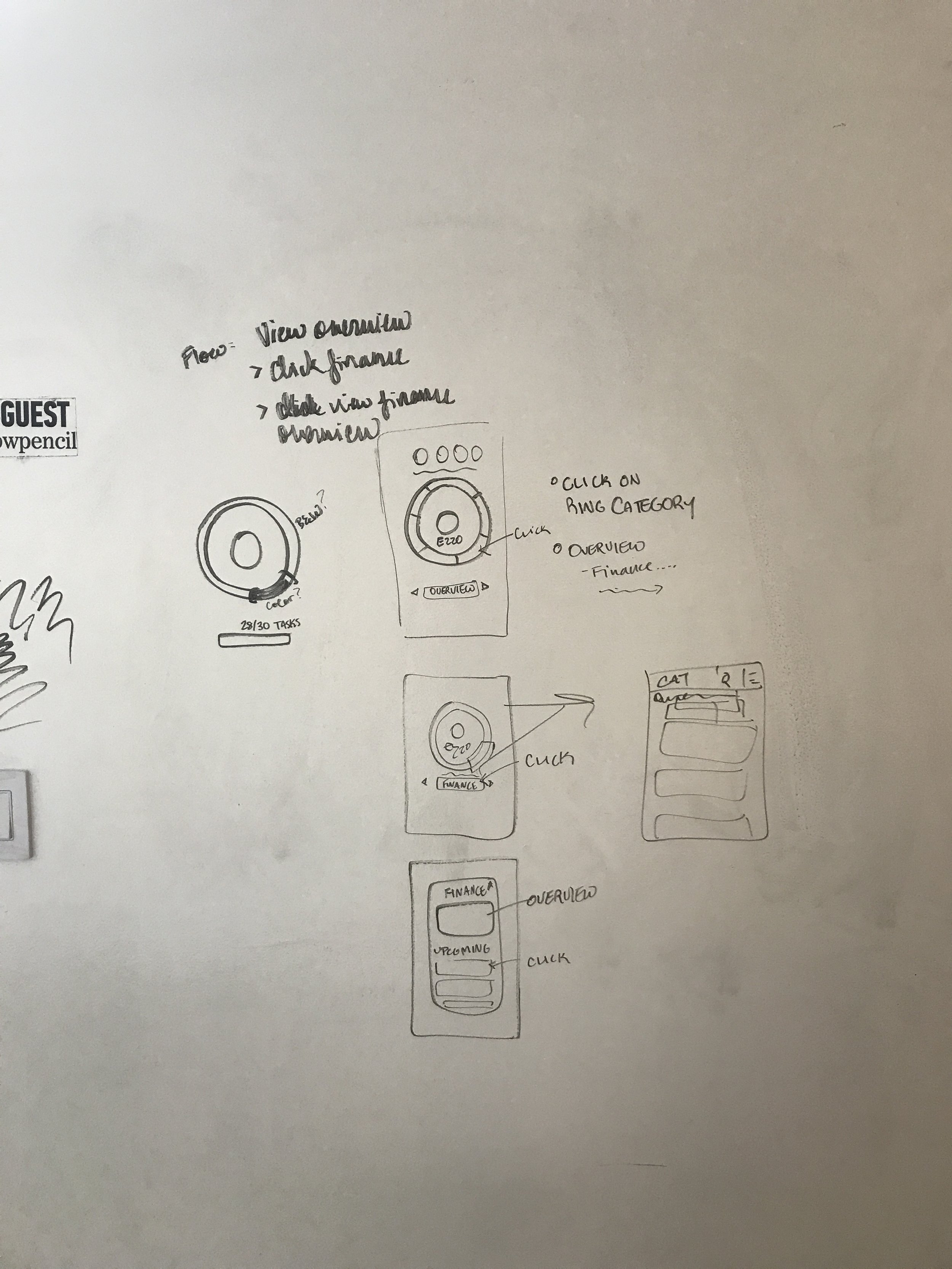
CUSTOMER USER FLOW
During the research process, we mapped out Karen's current user flow from the initial home page to the original dashboard.

Original User Flow

Original Karen Dashboard
AREAS OF IMPROVEMENT
We took a look at the initial user testing data from the desktop platform and deduced four major areas of improvement in the customer's journey.
On-Boarding
Initial on-boarding is heavy and tedious and did not introduce the users to the dashboard interface.
The Task List
Users were immediately inundated with a large task list. This caused confusion and made it difficult to use & understand the dashboard.
Dashboard
Improve information architecture and hierarchy. Users could not differentiate between what a task and a category were.
Brand Clarity
What is Karen and who is it for specifically for?
From these four areas of improvement we were able to create targeted goals for the project.
THE GOALS
Create an easy & seamless on-boarding process that is welcoming, easy to understand and gives users the option to utilize the application at their own pace.
Determine the optimal flow for users to complete the customization of their experience (survey).
Implement prioritized features that will increase the conversion rate of active to returning users.
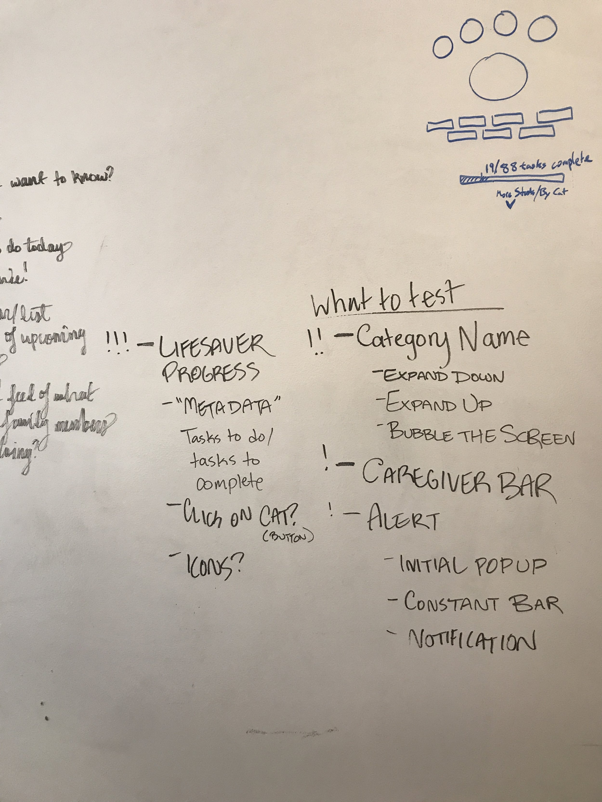
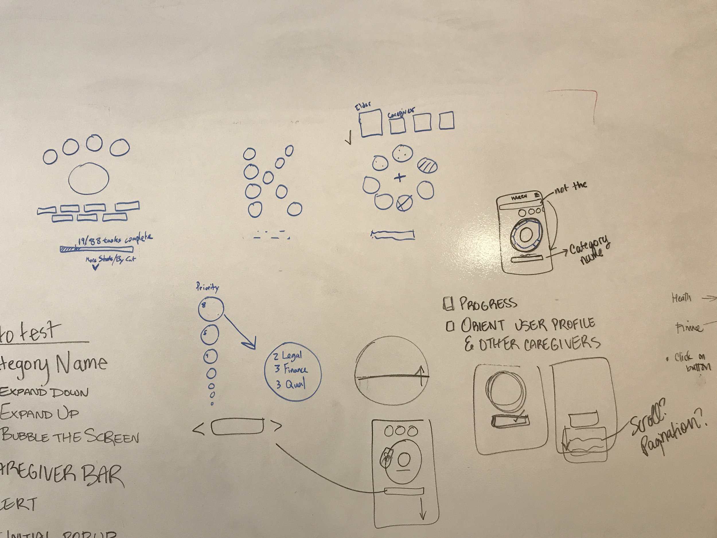
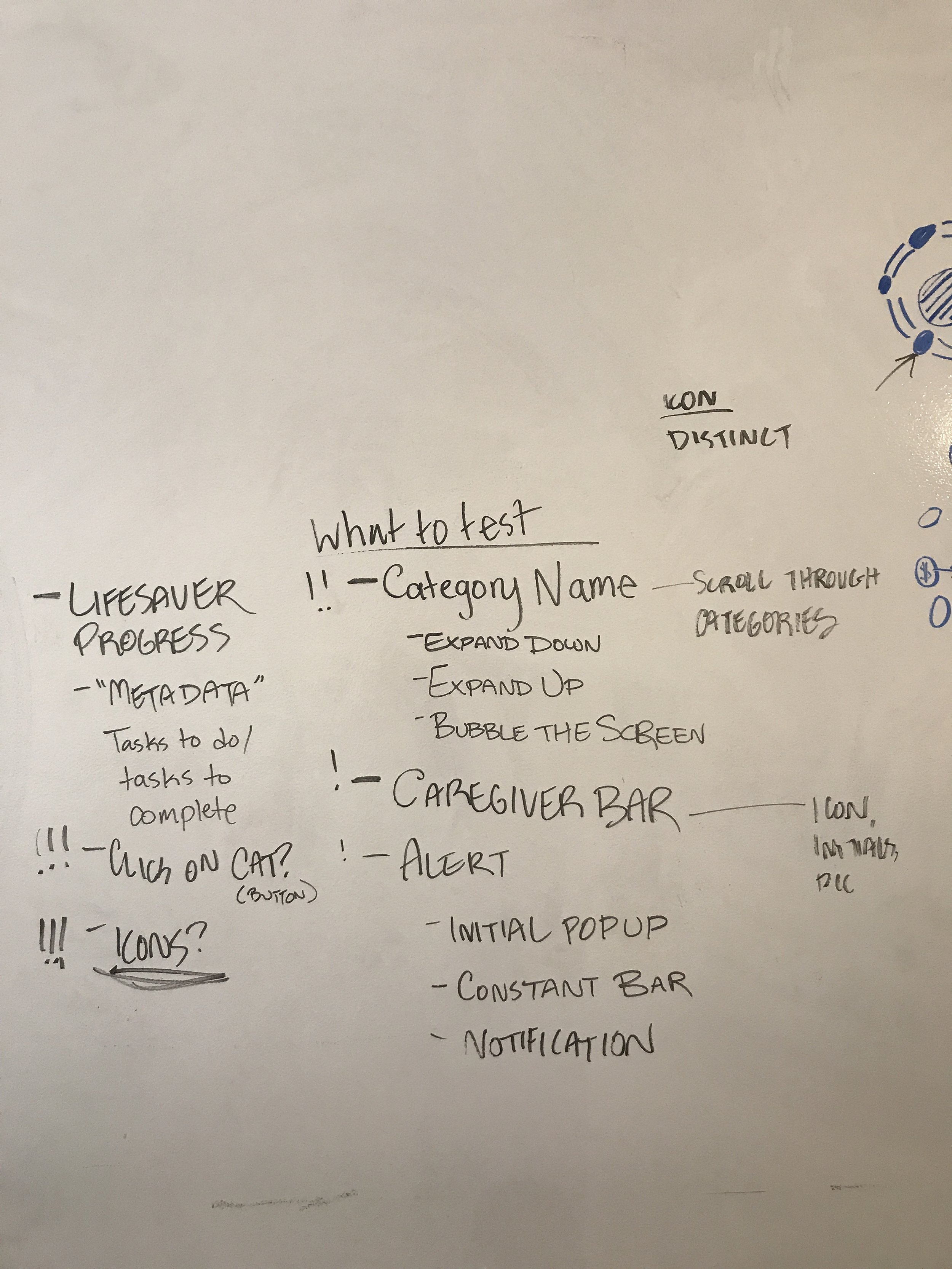
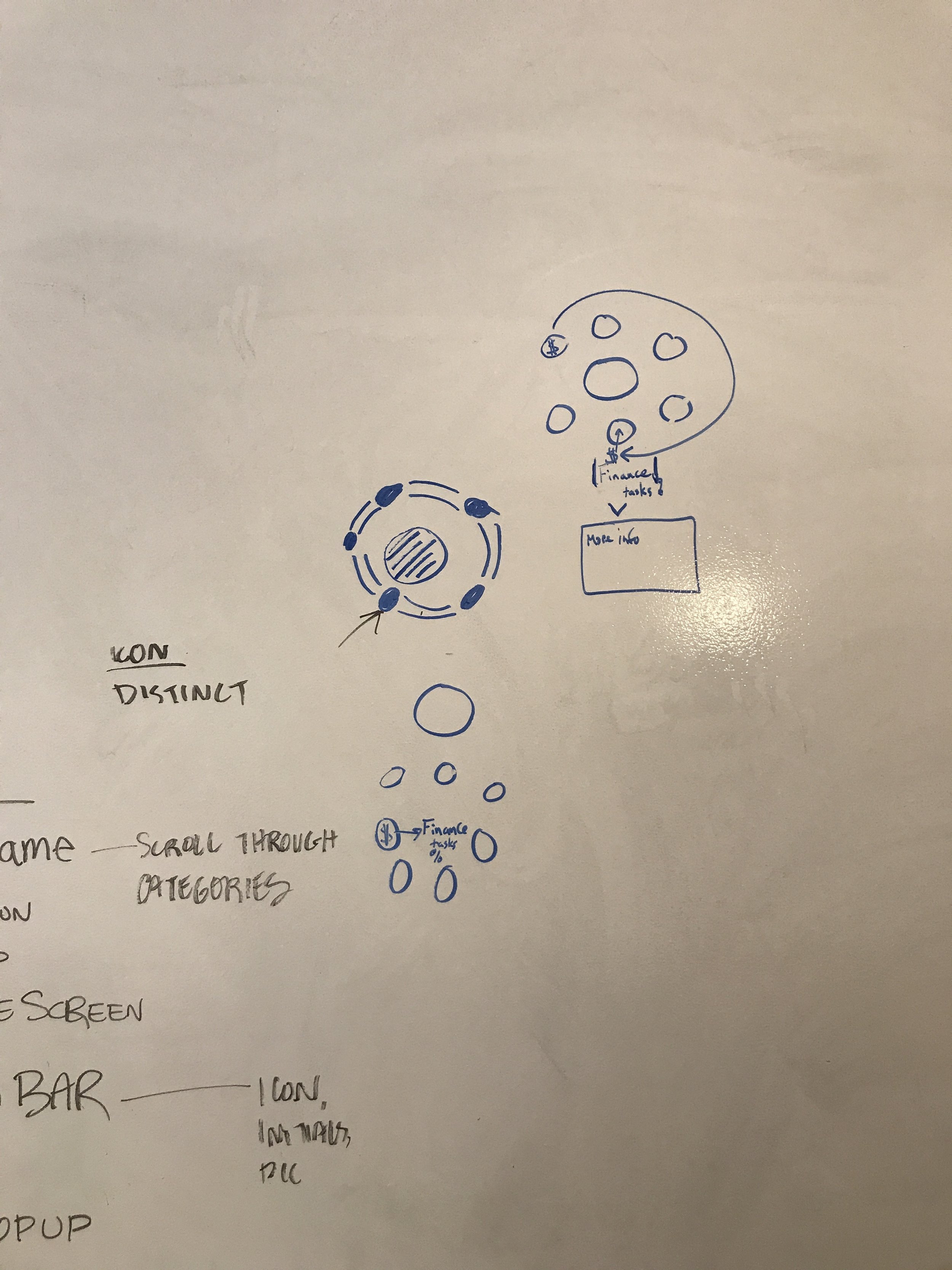
DESIGN STUDIO & SKETCHES
From our research, we conducted several design studios to conceptualize different ways to improve Karen. We combined our favorite aspects from each of our designs.
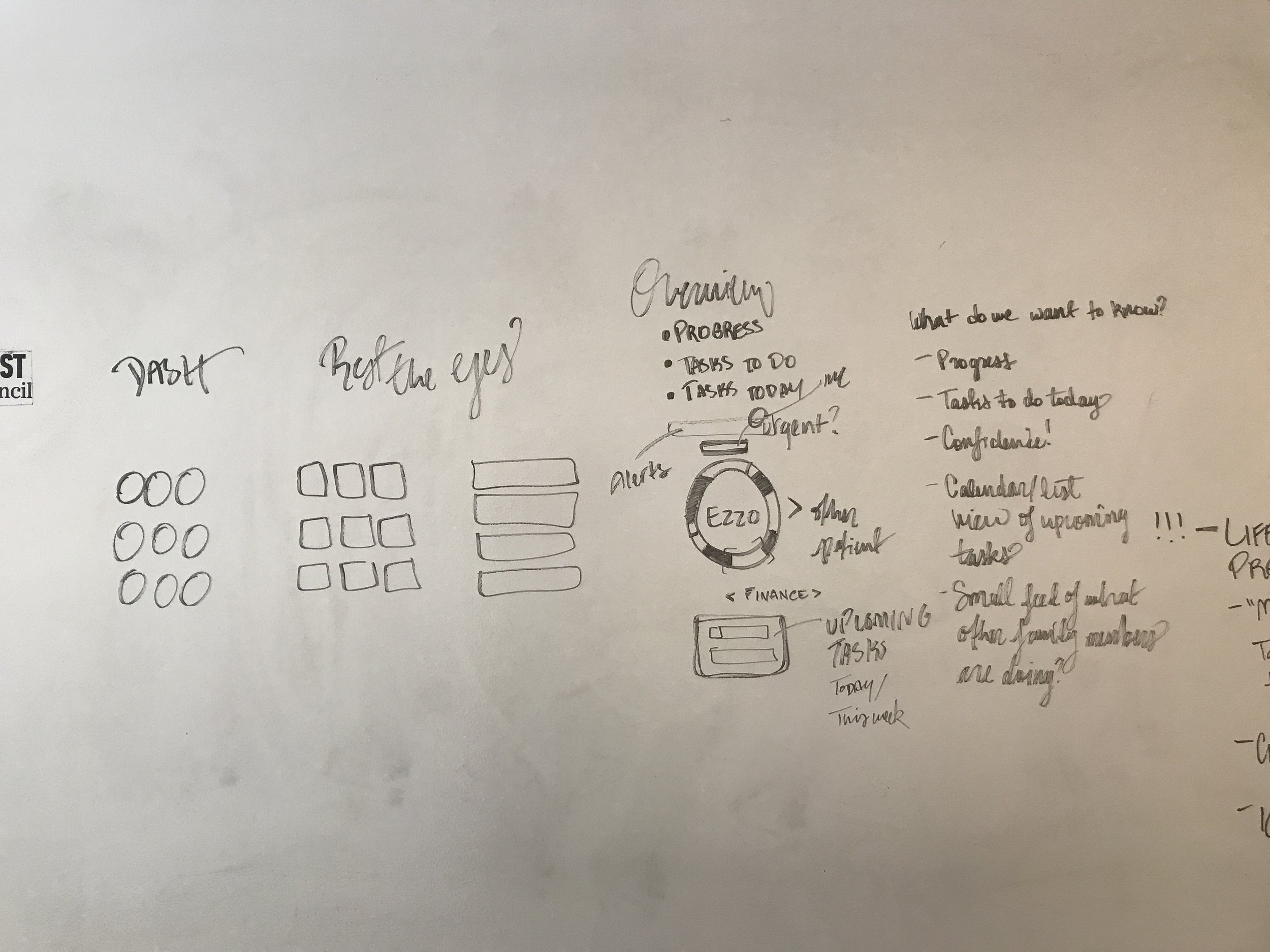
DESIGN SOLUTIONS
BRAND CLARITY
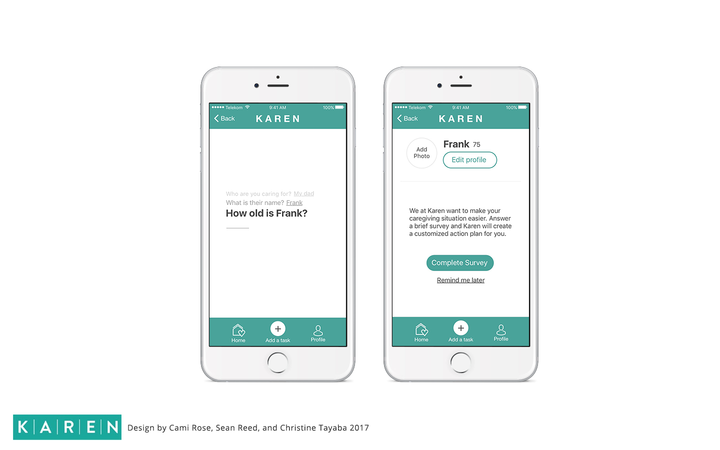
Through our research, C&C analysis and design studio we created a 3 step introduction to the app that clearly communicates what Karen is and how it can be utilized.

ON-BOARDING & FLOW
One of the goals of Karen is to provide a comfortable, easy to access experience.
We incorporated these elements so that
1. users can go at their own pace
2. users are introduced to the functionality and value of the app
3. it communicates in a kind, welcoming tone.
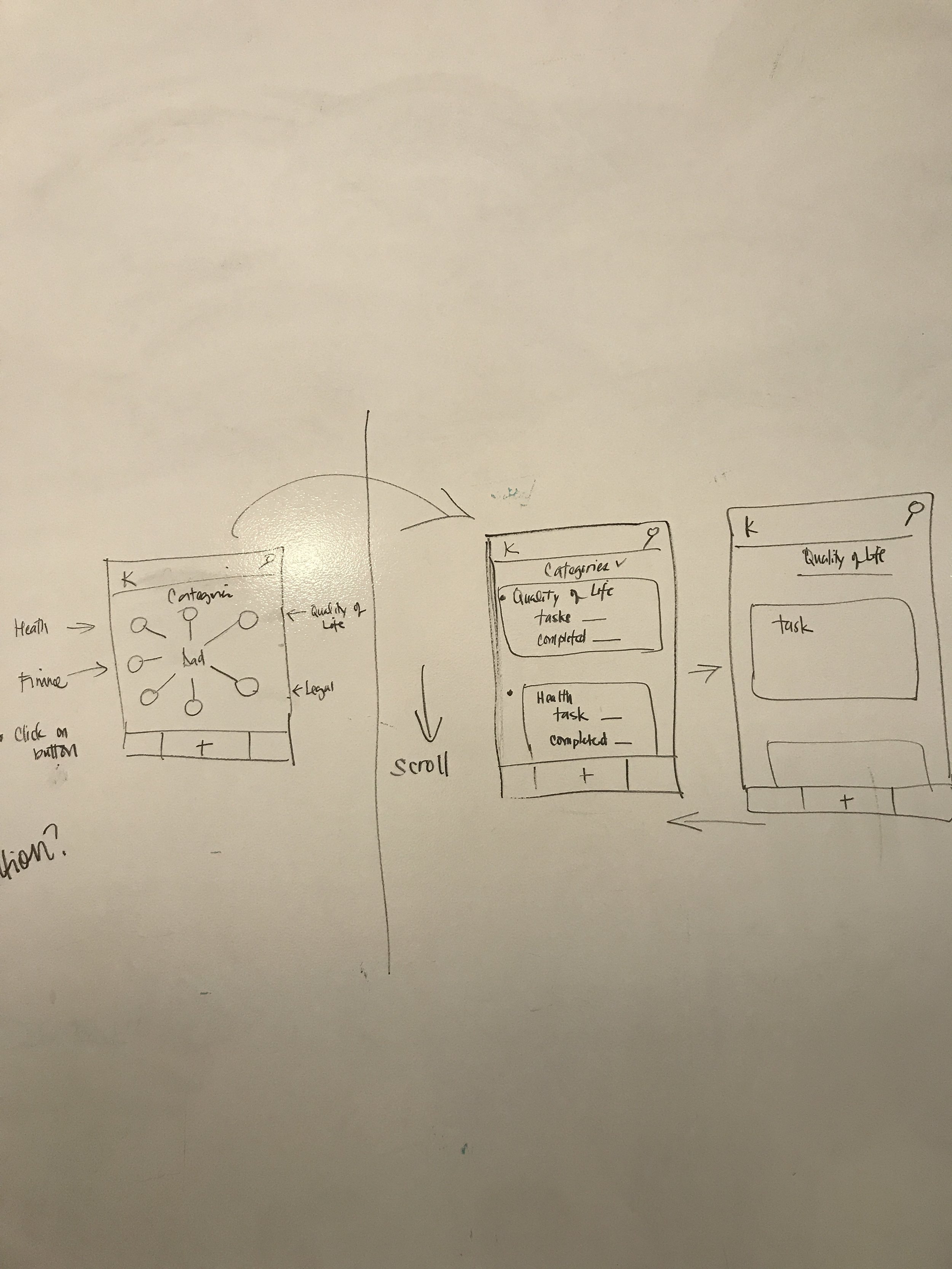
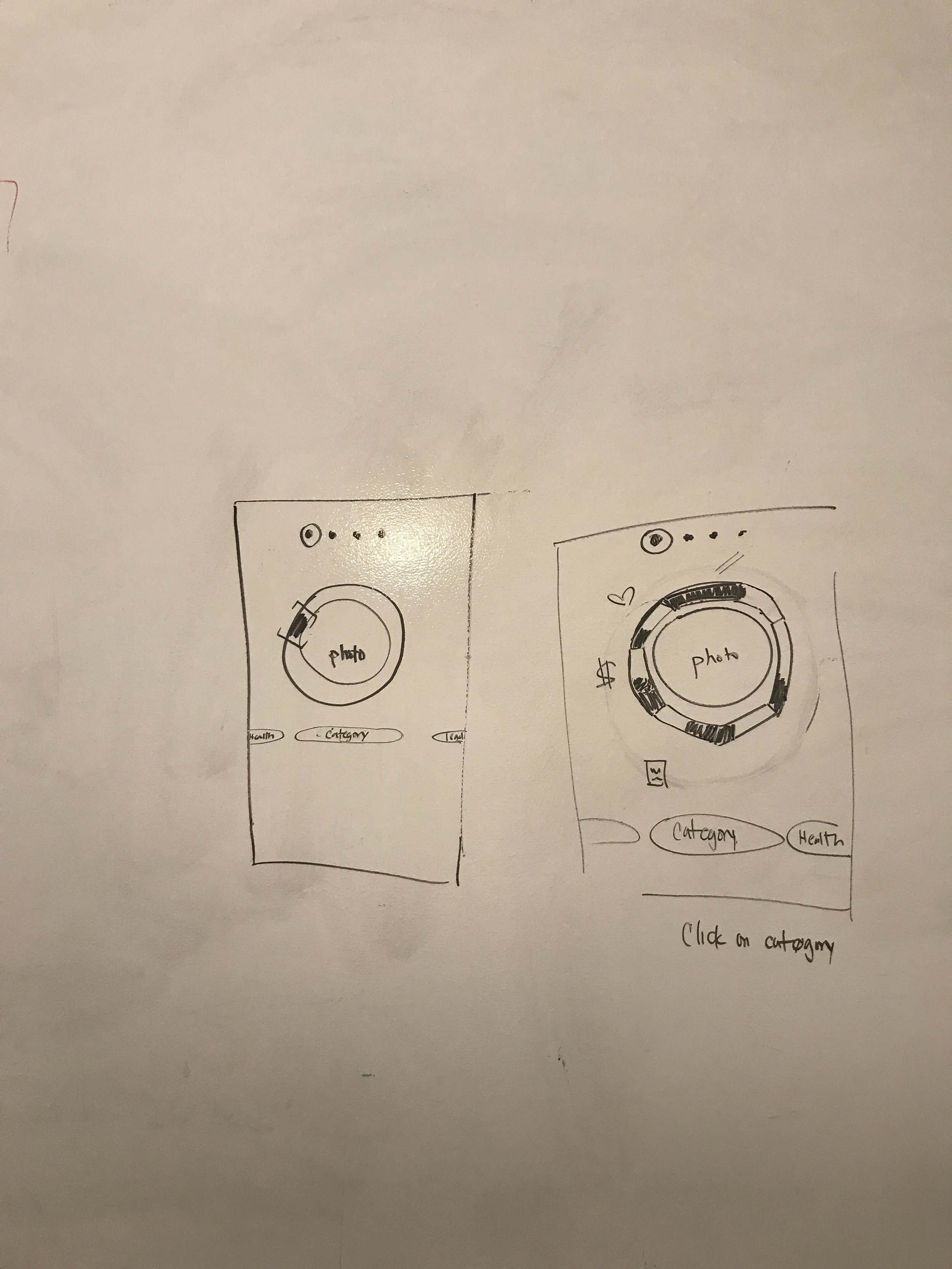
DASHBOARD
The users could not differentiate the categories from the tasks on the dashboard. Our solution creates (in the on-boarding) a thoughtful clear introduction to the dashboard, task/task completion bar and categories.
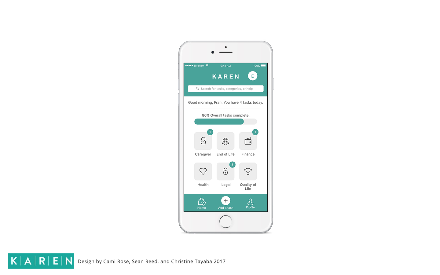
TASK LIST
In the web app, users (like Fran) were inundated tasks and a large action plan, this translates well when on paper but not in a mobile task management app.
In designing the task list, we made sure the interface was simple & understandable. We implemented core functions to: complete, delete, and edit tasks, change the due date/ability to create recurring tasks, and the option to assign the task to another family member.

FINAL TAKEAWAYS
We received positive feedback from three target users from our Invision prototype. All users said that they would use an application like Karen.
Users understood the brand, the purpose, and appreciated the self-pace functionality & sense of security.
The category "End of Life" made one user sad. Users expressed interest in expert guidance & help.
Working with Karen was an incredible experience. There are improvements to make, but overall the stakeholders were deeply pleased and inspired by our work.